Quantcast
Channel: DevExpress Support Center (Examples)
Viewing all 7205 articles
Browse latest View live

How to color time cells partially

$
0
0

This example demonstrates how to indicate special time slots with a custom color with a minute accuracy.

Starting with v19.2, SchedulerControl supports Time Regions. They allow you to highlight a certain group of cells (or their parts). For this purpose, it's sufficient to define a collection of such Time Region descriptors and use this collection in DataSource's TimeRegionsSource property. To declare mappings to properties from these descriptors, use the TimeRegionMappings object:

[XAML]
<dxsch:DataSource...TimeRegionsSource="{Binding TimeRegions}"><dxsch:DataSource.TimeRegionMappings><dxsch:TimeRegionMappingsId="Id"ResourceId="CalendarId"Start="Start"End="End"Brush="Brush"RecurrenceInfo="RecurrenceInfo"/></dxsch:DataSource.TimeRegionMappings> ... </dxsch:DataSource>

In this example, the lunch time is highlighted with the help of such Time Regions. A collection of their descriptors are available from the TimeRegions property from the CellCustomizationDemoViewModel class. To repeat these regions, their RecurrenceInfo property contains corresponding recurrence settings. These settings are built with the help of the RecurrenceBuilder class.

Blazor Editors - How to implement the multiple selection editor

$
0
0

This example illustrates two different ways to implement the multiple selection editor. In both case our DxListBox box is used.
 

• In the first way, our DxListBox component is placed inside our DxPopup component.
• In the second way, the Bootstrap Dropdown widget is used, and DxListBox is placed inside that. This approach requires including the following JS libraries: jQuery, Popper, Bootstrap.

OBSOLETE - Reference properties editing in the batch mode

How to use ExpandoObjects with GridControl

$
0
0

In WPF you can create dynamic objects that can have a different set of properties at runtime. GridControl supports one such dynamic object out of the box: ExpandoObject. This example illustrates how to use such objects with GridControl.

How to use a custom UserControl as a tooltip

$
0
0

Starting with version 19.2, you can show flyout hints that support any control as their content. Refer to the ToolTip Types help topic for more information in this regard.

dxImage.png

If your task is to manually show a form with any content, consider the use of FlyoutPanel that we support starting with version 13.2.

For earlier versions:

This example demonstrates how to use any control as a tooltip for DevExpress controls. You can find more information in the GetActiveObjectInfo article.

How to use reporting controls in ASP.NET Core applications

$
0
0

This example demonstrates how to use the End-User Report Designer and HTML5 Document Viewer in an ASP.NET Core application that targets both .NET Standard and .NET Framework.

These controls require the DevExpress.AspNetCore.Reporting  NuGet and devexpress-reporting npm packages. To integrate these controls into an application, register the required services in the Startup  class, reference the necessary client resources and use the ReportDesigner  or WebDocumentViewer  wrapper.

These are the main steps to integrate these controls into an application:

1. Install the DevExpress.AspNetCore.Reporting NuGet package.
2. Install the devexpress-reporting npm package.
3. Register reporting services in the Startup class.
4. Reference all the required client resources in the View file.
5. Use the ReportDesigner and WebDocumentViewer wrappers to display reporting controls on your web pages.

Before running this example, do the following:

1. In Visual Studio, right-click the package.json file and select Restore Packages to add the node_modules folder to the application project.
2. Right-click the ASP.NET Core application and select Manage NuGet Packages. In the invoked window, switch to the Updates page and update the DevExpress.AspNetCore.Reporting package. You may need to add a new NuGet package source to install DevExpress packages online or offline from the C:\Program Files (x86)\DevExpress 18.2\Components\System\Components\packagespath.
For more information and step-by-step tutorials, refer to the following documentation topic: ASP.NET Core Reporting.

How to hide grid lines in a Scheduler view and change the view's background

$
0
0

This example demonstrates how to define a custom CellStyle to specify a white background for cells and hide grid lines in views.
Starting with version 19.2, the Scheduler control provides an advanced functionality to highlight custom intervals - Time Regions. See how to use this feature in this example: How to highlight intervals in Scheduler.
In scenarios when it is necessary to re-colorize the entire SchedulerControl, use a custom Brush Provider instead.

How to disable a particular row in the GridView

$
0
0
Starting with version 19.2 we supported this functionality out of the box via the Disabled Cell Behavior

This example demonstrates how to enable/disable rows using the new behavior. A disabled row is a row that has specific appearance, and its in-place editors can't be activated.

For older versions, this example illustrates how to create a helper class to accomplish this task.


How to show NullText in a focused editor

$
0
0

The NullText property allows you to show a custom caption in empty editors. The default behavior is that focused editors hide this caption. To change this behavior in v19.2 and newer, set the built-in ShowNullTextIfFocused property to true.

How to edit time within the DateEdit popup (Vista mode)

$
0
0

In v19.2 and newer, you can use DateEditNavigatorWithTimePickerStyleSettings to show the time editor in the popup.

[XAML]
<dxe:DateEdit><dxe:DateEdit.StyleSettings><dxe:DateEditNavigatorWithTimePickerStyleSettings/></dxe:DateEdit.StyleSettings></dxe:DateEdit>

Blazor Data Grid - How to save/load a grid's layout information

$
0
0

This example illustrates how to use the LayoutChanged, LayoutRestoring events and the SaveLayout and LoadLayout methods to save layout information to some storage. After that this information can be restored and applied to DxDataGrid.

Note: as this example illustrates a general approach, layout information is stored in the UserLayoutManager singleton service. This service doesn't identify the current end user.

The Index.razor page contains two DxDataGrids.

• The first grid handles the LayoutChanged and LayoutRestoring events. The current layout information is stored in the singleton service and is restored from this service inside these event handlers. So end-user modifications (paging/sorting/grouping/filtering) will be restored automatically after a page reload.
• The second grid saves and loads layout information using external buttons where the SaveLayout and LoadLayout methods are called. Click the "Save current layout" button to save the current layout information. The corresponding item will be created in the external list box. Then select any item in this list box and click the "Load layout" button to load the corresponding layout information.

How to customize the appointment flyout or tooltip

$
0
0

SchedulerControl can display additional information for appointments when the mouse pointer hovers over them. For this, it uses either the corresponding FlyoutControl or ToolTip elements. To define which element should be used for this purpose, use the ToolTipMode property.

To customize the appearance of this FlyoutControl or ToolTip element, define a custom DataTemplte in the FlyoutContentTemplate or ToolTipContentTemplate property respectively. This example illustrates how to do this.

FlyoutAndTooltipContentTemplate.gif

How to Update Entire Row

$
0
0

If the GridControl is bound to server-side data, handle the GridViewBase.ValidateRow event to check whether a datasource can update a row after you click the Update button. If true, post changes manually; otherwise, the GridControl will allow you to correct values or click the Cancel button to return the previous values.

Web Dashboard - How to create new JSON data sources at runtime

$
0
0

You can provide end users with the capability to create a new data connection for a JSON Data Source at runtime.

To enable the capability for end users, set the canCreateNewJsonDataSource property to true:

Platform | API
-----|------
HTML JavaScript | DataSourceWizardExtensionOptions.canCreateNewJsonDataSource
ASP.NET Core | DataSourceWizardOptionBuilder.CanCreateNewJsonDataSource(Boolean)
MVC | DashboardExtensionSettings.CanCreateNewJsonDataSource
Web Forms | ASPxDashboard.CanCreateNewJsonDataSource

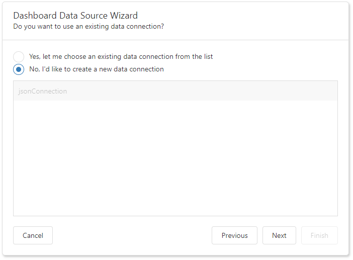
After that, the "Choose Connection (JSON)" page allows end users to create new data connections:

Can create new data connections

On the server side, implement the IDataSourceWizardConnectionStringsStorage interface to provide an end user with the capability to save the created JSON data connections. Use the created class instance as the ASPxDashboard.SetConnectionStringsProvider / DashboardConfigurator.SetConnectionStringsProvider method's parameter.

See Also • Dashboard Data Source Wizard
Customize the Dashboard Data Source Wizard

Files to look at:

Startup.cs
Index.cshtml

DataGrid - Display tooltip for data cells

$
0
0

This example illustrates how to display a custom dxTooltip when the cursor hovers over the cells of a certain column. We handle the onCellPrepared event to subscribe to the cell's mouseover / mouseout event and populate the tooltip with the associated data row values.


How to Manage Tracked Changes in the Document

$
0
0

Files to look at:

Program.cs (VB: Program.vb)

The following code sample project shows how to use Word Processing Document API to accept and reject revisions. Enable change tracking, specify revision's display options and export the result to the PDF format.

Files to look at:

Program.cs (VB: Program.vb)

How to Manage Tracked Changes

$
0
0

Files to look at:

Form1.cs (VB: Form1.vb)

The following code sample project how to use the RichEditControl to view, accept and reject revisions in the document. Specify display options for revisions and reviewers whose revisions should be displayed.

image

Files to look at:

Form1.cs (VB: Form1.vb)

How to Manage Tracked Changes in DXRichEdit

$
0
0

The following code sample project shows how to view, accept and reject revision in RichEditControl for WPF. Specify display options for revisions and reviewers whose changes should be displayed.

image

Pivot Grid Optimized Mode - Field Calculation Data Binding

$
0
0

This example demonstrates how to use a Data Binding API to specify the PivotGridField's data source. Instead of bound and unbound fields, the Data Binding API allows you to specify the data binding source. The former bound field gets data from a data source column - the bound field is a field bound to data with the DataSourceColumnBinding instance. The former unbound fields are fields that get data from calculations (ExpressionDataBinding), specific window calculations (RunningTotalBinding, MovingCalculationBinding and others), or from a window calculation specified by an expression (WindowExpressionBinding).

The Data Binding API is in effect only in the Optimized Mode. Other calculation engines ignore the PivotGridField.DataBinding property.

The project uses the ExcelDataSource component in the ExcelItemsSource wrapper. It requires references to the following assemblies in addition to references created automatically when the PivotGrid control is dropped from the Toolbox:

• DevExpress.DataAccess
• DevExpress.Xpf.Core.Extensions
• DevExpress.Xpf.Grid
• DevExpress.Xpf.Grid.Core

See also:

Optimized Calculation Engine

Files to look at:

MainWindow.xaml

Get Started - Create an ASP.NET Core 2.0 Dashboard Application (Runtime sample)

Viewing all 7205 articles
Browse latest View live


<script src="https://jsc.adskeeper.com/r/s/rssing.com.1596347.js" async> </script>